
Homebase is a platform that helps businesses manage employee scheduling, time clocks, payroll and more.

Real-time information for on-the-go managers and owners.
As the primary designer for Homebase's mobile app, I spearheaded the design of the mobile app, where I worked on several pods, including one that aimed to enhance the user experience for owners and managers.
This case study provides an overview of a collaborative project we undertook to enable owners and managers to manage their stores while on the go efficiently.
Context:
Homebase helps owners and managers who oversee hourly workers, many of whom are frequently on the go or working on the floor and away from their laptops. Although the web app offers most of the features required to manage their stores, they need a quick and convenient way to take action on pressing matters in real time. We identified an opportunity to enhance the mobile app and empower busy owners and managers on the go. Our primary objective was to enhance the experience of managing employee scheduling, time clocks, and other critical tasks through the mobile app. We closely collaborated with the customer support team and users to gather feedback, design new concepts, and conduct user testing to refine our approach.
Target users:
Managers and owners on Homebase who find themselves needed to manage their store on the go.
Problems and opportunities:
We spoke to 15 managers and owners and collaborated with our customer success team to uncover the following themes:
Have a birds-eye view of what's happening in my store right now:
The store opened 2 hours ago:
Was it opened on time?
Did I schedule enough people for today?
Quickly action on an employee:
Late employee:
Is Quin coming in? Do I need to cover his shift?
Upcoming employee:
I need to call Belinda to come in later than scheduled
Past employee:
Tina forgot to clock in on time and I need to adjust the time manually
Clocked-in employee:
I need to message Maria and let her know that Quin will be late
In conclusion, managers and owners away from their computer they need a way to manage their store on the go.
Restrictions:
Feature parity across desktop and mobile
Eng team needed to complete work within two sprints (4 weeks)
My role:
Sr. Product Designer
Tools:
Figma & Adobe Illustrator
Team:
Small cross-functional pod consisting of a Product Designer, Product Manager, Data Scientist, UX Researcher, and Engineering.
Enhancing feature parity across the desktop and mobile app.
The web team had just begun building the new experience of the manager dashboard, as seen below. The design had gone through rounds of user research, user testing and design iteration. On the web app, users can take quick actions on their operations. We needed to ensure the mobile app's dashboard had the same experience so users could seamlessly flip between the web and mobile to take action on tasks in real-time.
Problem:
Mobile app lacked features, limiting on-the-go managers and owners from effectively managing stores without a desktop.
Goal:
Elevate the mobile app experience to match the desktop app's UX

New desktop design:
The current mobile experience.
The current mobile app experience was lacking in multiple aspects, including a noticeable disparity between the desktop and mobile app experiences that made switching between the two challenging for users. The mobile app also did not provide essential information at a glance and lacked quick actions for users. Additionally, the app was riddled with glitches and required significant improvement.

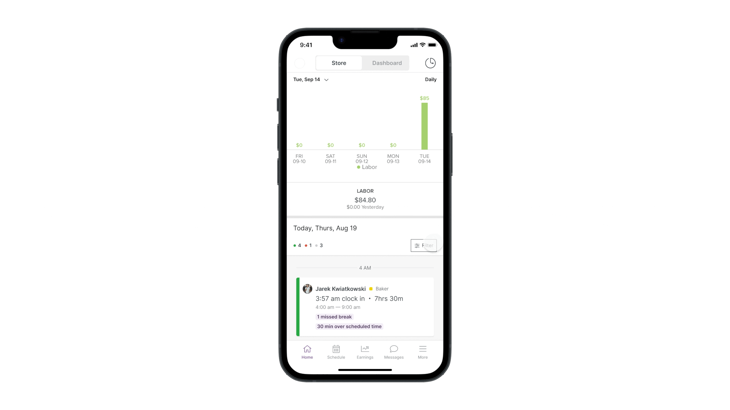
Current mobile design:
Improved mobile experience.

Below you can see the updated mobile experience. We updated the UI to align with the web experience and leveraged native iOS and Android action sheets customized for timely task actions to meet the 4-week project limitation.
Example of an action sheet flow:
Detailed view of the cards:
Detailed view of the action sheets:
The addition of filtering.
We also implemented filtering in the mobile app to enable users to efficiently address relevant issues, including real-time floor updates, employee attendance, and more, without spending time scrolling back and forth. Additionally, we wanted to expand this feature across the entire app to provide a consistent user experience in other experiences.
Our UX researcher arranged 10 Zoom calls with current users and conducted 5 sessions with non-users on usertesting.com, using prototypes that I created with Figma. The feedback received was overwhelmingly positive, with three common themes emerging from the sessions:
Users could understand how to take action on an employee and found the information on the card very useful.
They wanted additional functionality to add notes to employee files. For instance, if an employee was late, they wanted to add a note about the cause. This was presently beyond the project's scope, but we noted it for future sprints.
While filtering, users had difficulty locating the close button. To tackle this problem, we included a more noticeable 'done' button within the filtering drawer.
User testing feedback.
Updated filtering design:

Increase task success by surfacing more actions that are directly related to the employee or the team management aspect from the store tab.
Decrease time spent to publish a schedule change from the store tab by streamlining the update schedule flow from the store tab.
Goals and expected impact.
Want more details about this project?
Let’s chat more about my work experience. Email me hello@stephjuliet.com